You’re busy. We know. But before you pull in slides from your boss’s deck or grab those charts from the marketing guy, ask yourself: Am I offering a clear storyline with an agenda, or am I just creating a fancy-looking hodgepodge with no strategy?
Don’t feel bad. We ALL try to save time by leveraging other people’s slides, but few of us actually improve our presentation when we do it. Instead we create the…*eeeeek!* ”Frankendeck.”
Frankendecks Lack a Framework
“Frankendecks” are rampant in today’s business presentations because they seem to save time, add design pizzazz, or let us quickly fold in some juicy data. But this visual mishmash causes three big problems: It creates a deck that lacks narrative clarity, it doesn’t address customer needs, and finally, it doesn’t further any coherent agenda, objectives, or goals. This last one is particularly bad because this is why everyone’s gathered in the first place! What a waste of time.
So yes, “Frankendecks” can create confusion, but that doesn’t mean you can’t combine your homemade slides with borrowed ones and have a powerful presentation. All you need is a solid story framework.
The Story Framework Creates a Clear Narrative and Saves Time
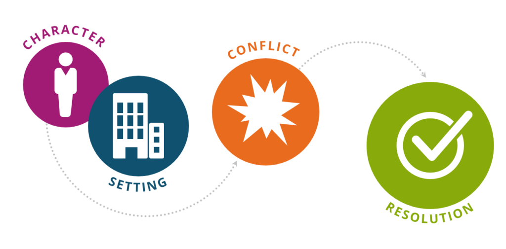
A story framework gives structure to your all your facts and data. It’s a basic roadmap for building narratives that follows the classic signposts of storytelling: setting, character, conflict, and resolution.
- Setting is a snapshot in time, a place, or a circumstance. It immediately establishes the context for your message
- Characters are who or what is affected by the current situation — your customers, employees, or team.
- Conflict is what provides the tension that gives your audience a reason to care.
- Resolution is your recommendations, product, or solution.
With a story arc established, it is much easier to incorporate slides built originally for another presentation. You will immediately see where they fit best into your narrative to support your desired outcome. Also, you’ll avoid extraneous information that detracts from important insights and doesn’t further the objective of your presentation.
Visuals Must Punctuate Your Ideas and Further Your Narrative
Make no mistake, we love pretty slides! But we strongly believe that unless the slides you are hoping to leverage bear visuals that crystallize your main ideas or further your story, you must edit them. Once you’ve outlined your story using the framework, visual tactics such as use of color, shapes, and focal points (“callouts”) will shine a spotlight on your key ideas.
Another practice that deepens the link between your narrative and your visuals is using active headlines. Rather than using vague slide headlines (such as “Q4 Update” or “Industry Trends”), active headlines put the most important message right at the top of the slide. They are usually conversational, attention-grabbing, and serve as “chapter headings” for your unfolding story.
It’s important to add: Powerful visuals and active slide headlines are even more crucial if you aren’t there to present the deck yourself. Your narrative must always be clear and speak for itself.
We are all pressed for time and few of us are scriptwriters or designers. So, by all means, leverage slides from those around you! But remember, having a clear story framework enhanced by great visuals makes incorporating those slides from your boss or your colleagues much more useful. It tells you exactly where everything belongs within the journey. It also ensures that every time, you have a solid strategy that elevates the conversation beyond just the obvious.
Ready to evolve from “Frankendecks” to visual stories? Find out more about our business storytelling workshop for teams.


